I am not so sure, however, about my feelings on the new logo they are going to be unveiling. [Note: they say this is only one aspect of the new logo, which they are unveiling on September 16, so this may be a tad premature, but you know I'm always on the cutting edge.]
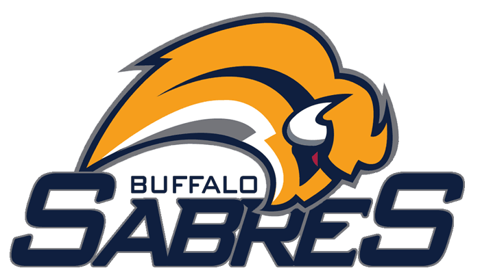
It would be a cool secondary logo, actually, as it is indicative of a certain style. But as a primary logo -- the one to be worn on the front of the jersey and on all the merchandise, the identity of the team -- it is a bit too abstract and doesn't actually look like a buffalo. People on certain message boards are calling it the Buffaslug.
What makes things even harder to swallow is that the logo below has been floating around for about three years.
It was proposed by a guy named John Slabyk who is a logo designer. He brought the idea to Tom Golisano and the Sabres organization, and they balked for whatever reason. I think this design is great. It's classy, has a nice color scheme, and is a sharp update of their classic uniform from 1970-1995, shown here:

I have mixed feelings about their last uniform, known to many of us as the "Goat Head."

Ultimately, though, it became a symbol of a team that was very good for a long time (except for a few years) and nearly made the Stanley Cup Finals last year.
One thing I do like about the new logo is that they keep the buffalo/buffaslug's trademark red eye, which all the logos have had. I'm not sure why I like that, but there's something nice about the continuity there.
It's not like I'm gonna stop rooting for the Sabres if their uniforms suck, but with all the great concepts and options I've seen out there, I would think that they would think long and hard about it, and hopefully listen to the fans. It's worked before, when the Islanders got rid of their Gorton's fisherman logo after one season due to fan complaints, and the 49ers scrapped their infamous and godawful "One Day Helmet" after (take a guess) only one day, due to public outrage. Tom Golisano, who is a billionaire and owns the Sabres, did not become a billionaire by being unsavvy. I am hoping that he does the right thing and makes the jerseys and logo aesthetically pleasing.
[Update: There is video of the ice rink painted with the new logo below.]


![PINBACK - Tour EP 2008 [Ascii E.P.]](http://static.rateyourmusic.com/album_images/63ec90926c6dfa6b71b7f76871fde530/1854204.jpg)


1 comment:
That logo is fucking terrible. I love the old school logo that ended in '95 I guess. The "goat head" was bad enough but now this one? It looks like the fired cartoonist and aspiring Japanime artist on the Cartoon Network puked this out in a terrible moment of clarity. I hope Crapchestarian Galisano comes to his senses and gets rid of this thing.
Post a Comment