I am trying something new here. Maybe it will be a runaway hit, and maybe I will lose interest. It's a new N.O.C.W.I.T. feature called "Bad Sports Logos." Here we celebrate some of the worst ideas in sports logo concepts. I wanted to toggle between pro and college sports, as well as major and minor leagues. If anyone has any comments or suggestions for really horrible sports logos, please pass them along. For now, I will utilize Chris Creamer's magnificent Sports Logos site.
When you are the Los Angeles Clippers, you have a few strikes against you. First of all, you are probably the worst franchise in all of major professional sports (this season notwithstanding) and easily in the bottom three.
Secondly, you share not only the same city, but the same arena as the Los Angeles Lakers, one of the marquee franchises not only in basketball, but in all the sporting world.
You have a terrible, cheap owner, and a major inferiority complex. But most of all, you have a very bad logo.
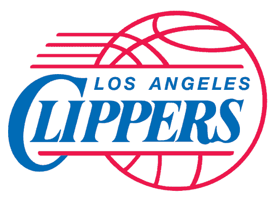
Now the logo is very competent. The lines are sharp. The basketball icon is nearly a perfect circle. The blue and red color scheme is pleasant enough. But has there ever been a logo in the history of sports that has such a combination of being bland and non-threatening? I can't think of one.
The NBA is a league of very bland logos to begin with. In fact, until the last few years, most NBA logos consisted of little more than a basketball and some words. And perhaps a vague prop to jazz it up a bit.
To wit:


Not much imagination. The difference is this: within the last decade and a half, all of the above logos have been changed and or snazzed up to keep up with the explosion in marketing and sales of jerseys. The Clips have done nothing since they moved to Los Angeles.
But this isn't even the worst logo this team has ever had. Before, when they were the San Diego Clippers (in the days of Ron Burgundy), this was the winner they came up with.

Ugh, don't even get me started on this piece of crap. Ostensibly, it's supposed to be a stylized fleet of clipper ships sailing against the San Diego sun. But I contend it was the winner of a "come up with the Clippers' logo!" contest, submitted by a third grader who had three colors of construction paper at his disposal.
My question is this: with the boom in sports marketing (especially since companies like Reebok and Nike are helping out with design), why haven't the Clippers tried to upgrade their look to go with their newly winning attitude? Think of the cool looking 3-D designs they could have come up with? A large ship? A gruff-looking sailor mascot? A large electric hair-cutting razor? (The razor could be teeth or something. Come on, somebody pay me for my high-concept ideas!)
You would think that the center of the entertainment world would be able to find a marketing or graphic design company that could make the Clippers the new cool team in town. Kinda like the Chicago White Sox became the hot-looking uniform in the Windy City in the early '90s and the Nets became the toast of the New York Metropolitan area in the last 5 years.
Come on Clips! I'll give you a start.

Just color it blue and red and put a big "LA" on it and let's get those new uniforms out by next season!


![PINBACK - Tour EP 2008 [Ascii E.P.]](http://static.rateyourmusic.com/album_images/63ec90926c6dfa6b71b7f76871fde530/1854204.jpg)


2 comments:
Personally, I would have to go with the Miami Dolphins Logo. There is nothing intimidating about a dolphin; people love them. And honestly, all I can think of when I look at the teal and orange color scheme is really horrid lawn furniture from the 60's sort of like the kind an old retired couple might have on the porch of their condo in Miami....hmmm.
Also, if we are talking all time bad logos, I have to go with the original Tampa Bay Bucanneers Logo at number 1. Let's face it a flaming orange, mustachioed, dude with a knife in his teeth, a feather in his cap and twinkle in his eye is a much more suitable logo for gay pride than a football team. Other really bad logos: the original San Diego Padre, the early 80's Denver Nuggets with the paint swath background and of course the Houston Oilers oil well.
Agreed...who is intimidated by a dolphin wearing a helmet that simply screams "special ed?"
Post a Comment